A projection showcase
If you've spent time hanging around with students, it's quite likely that you have had someone explain to you why the Mercator projection, which is the one seen in most standard world maps, is horrendously distorted and inflates the importance of wealthy northern European countries, Russia, Canada etc. over their less influential equatorial counterparts in Africa and South/Central America. This is true, at least to the extent that one should never use a Mercator map to compare areas of countries, or relative importance (if that's what you like to do).
The problems with the standard map projection arise from the issue of translating a spherical surface to a flat one - you simply can't preserve shape, size and direction when doing this. An example: it's possible to draw a triangle on a sphere in which every angle is 90 degrees, by drawing directly between the very top, left and front of the sphere. Try drawing that on a flat piece of paper.
Obviously, the best representation of the world's land masses is a globe, but atlas makers throughout history have consistently failed to invent a book with spherical pages, so a number of alternative projections have been made over the years. There is no 'best' projection from sphere to plane, but some are definitely better than others, and they are all good for different purposes, so any good classroom should probably have at least two. Here I present some of the most popular, and most interesting, of the bunch.
How to make it: Wrap a cylinder of photographic film around your globe, and then project a laser from the very centre of the globe through all of the land masses you want to mark. Unroll the cylinder, and there's your map.
Pros:
In all honesty, it is a fairly good-looking map, and gives a good idea of what shape countries are and how they relate to each other spatially. However, its representation of African and Central American countries as miniscule has probably led to more than a few people forgetting their significance in the world, which is manifestly not a good thing.
I, for one, see the augmented size of Antarctica as clear evidence that the Mercator map's ubiquity is down to a conspiracy of penguins.

Invented: Steve Waterman, 1999, inspired by Bernard Cahill, 1909
The Atlantic-centred projection. It's quite easy to see here how it's been unfolded.

The Panini projection is an answer to the same problem that Mercator tackled back in 1569, but instead of allowing us to map the world, it allows us to present more of the vistas we want to photograph and paint, and play video games with an experience closer to the real thing.
(By the way, I'd highly recommend downloading Blinky and having a play around. Playing Doom in a Pierce Quincuncial view is a very interesting experience.)
If you've stuck it out this far, congratulations. Hopefully you'll agree with me that the true mistake made by schoolteachers, and anyone else who picks a Mercator projection simply because it's the most popular option, is not in choosing the wrong map, but in assuming that there's only one best choice. This post hasn't even come close to covering all the different projections - or types of projections - and it certainly hasn't covered most of the good ones. But it might be enough to take your idea of how the world can look, and change it from a narrow field of view to a wider one.

"True geographers use the orange rind projection" - u/PorcineLogic, 2013
The problems with the standard map projection arise from the issue of translating a spherical surface to a flat one - you simply can't preserve shape, size and direction when doing this. An example: it's possible to draw a triangle on a sphere in which every angle is 90 degrees, by drawing directly between the very top, left and front of the sphere. Try drawing that on a flat piece of paper.
Obviously, the best representation of the world's land masses is a globe, but atlas makers throughout history have consistently failed to invent a book with spherical pages, so a number of alternative projections have been made over the years. There is no 'best' projection from sphere to plane, but some are definitely better than others, and they are all good for different purposes, so any good classroom should probably have at least two. Here I present some of the most popular, and most interesting, of the bunch.
Popular Projections
Mercator

The perfect map, if you live in Greenland.
Invented: Gerardus Mercator, 1569How to make it: Wrap a cylinder of photographic film around your globe, and then project a laser from the very centre of the globe through all of the land masses you want to mark. Unroll the cylinder, and there's your map.
Pros:
- Very easy to tell east/west, north/south and tell if two places are on the same latitude or longitude,
- Any compass direction from any point makes a straight line on the map, which is useful for navigation,
- The shapes of the countries, considered on their own, are all roughly correct,
- Fits into a rectangle, which is aesthetically pleasing and space-efficient for books and posters.
- Ubiquitous to the point where many people don't know that other projections exist,
- Sizes of areas get distorted towards the north and south poles (to extreme levels).
In all honesty, it is a fairly good-looking map, and gives a good idea of what shape countries are and how they relate to each other spatially. However, its representation of African and Central American countries as miniscule has probably led to more than a few people forgetting their significance in the world, which is manifestly not a good thing.
I, for one, see the augmented size of Antarctica as clear evidence that the Mercator map's ubiquity is down to a conspiracy of penguins.
Azimuthal Equidistant Projections

There's no escape, from Antarctica.
Invented: A long time ago, by astronomers
How to make it: Cut out all the continents from your globe, then place it down on the ground (usually resting on the North Pole). Fill a straw with bright powder paint, point it at the ground from a centred point just inside or above the globe, then blow through it to blast paint through all the continents and into a circle on the ground. Remove the globe.
Pros:
- All distances and angles from the centre are correct,
- It is circular if you like that kind of thing,
- Associated with the UN.
Cons:
- Directions from any point far from the centre are not correct,
- Doesn't fit well on a rectangular page,
- If you live in Australia, your country is represented as a slug,
- Associated with the Flat Earth movement.
Speaking seriously, this is a rather nice-looking map that doesn't have too many uses. One of its biggest advantages over other projections is that it very obviously does not represent size or shape correctly, so you're unlikely to fall into the trap of thinking that its depiction of the world is right.
I found a fun web tool for generating these maps around any given point, here.
Gall-Peters
Continental drip.
Invented: Rev. James Gall, 1855 and Prof. Dr. Arno Peters, 1973
How to make it: Make a cylindrical projection as with the Mercator map, but stretch the resulting map at the middle and squish it at the top. Be sure to do it in such a way that Croatia (45° North) is the correct shape.
Pros:
- All areas are correctly depicted,
- Favoured by UNESCO.
- It is hard to tell the shapes of most countries,
- Any compass direction other than direct north-south or east-west will come out curved on the map,
- Its fanbase is intolerable.
Interesting Projections
Dymaxion
Looks nice, right? Now look at those latitude and longitude lines.
Invented: Buckminster Fuller, 1943
How to make it: Find a regular icosahedron, and draw the world's continents on the outside. Cut along the edges, making sure to cut through as little land as possible, and unfold.
Pros:
- Good looking,
- Show the shapes and sizes of continents pretty well,
- Very good for demonstrating movements of early peoples as all of the most easily traversed routes appear unbroken,
- Shows the continents of the world as a roughly connected whole, rather than separated by the Atlantic, which is nice.
- Not useful for any kind of navigation,
- No directions, not even latitude and longitudes, are straight lines and most aren't even lines at all.
This was my favourite world map for some time. I'm not sure what that says about me.
Peirce Quincuncial

Be there or be square.
Invented: Charles Sanders Peirce, 1879
How to make it: Project the the top and bottom halves of your globe vertically onto two circles, assigning each point on the circles a complex number according to its location and using the ratio of two Jacobi elliptic functions to transform the numbers into locations on two squares. Finally, chop up and rearrange the two squares into a quincunx formation to make a single square. If you've done all that, make yourself a very large, very hot cup of tea and have a rest - you deserve it.
Pros:
- Does a much better job of showing size than many other maps,
- For the most part, it shows shape well also,
- Tessellates, so you can put multiple copies together into a grid to make a map that never ends,
- It's a square.
- Doesn't show straight lines very well,
- It's not very easy for a viewer to see how it relates to the surface of a sphere.
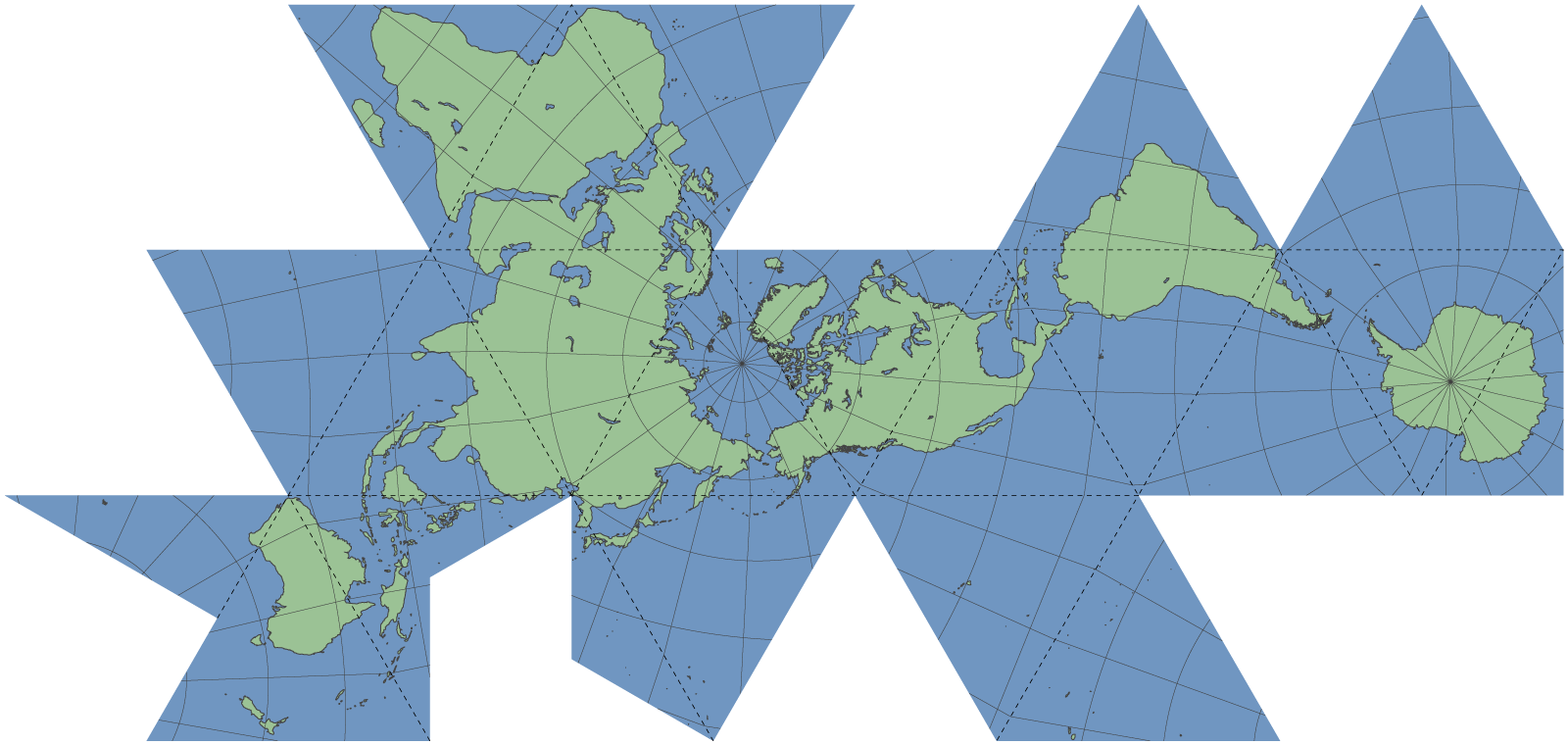
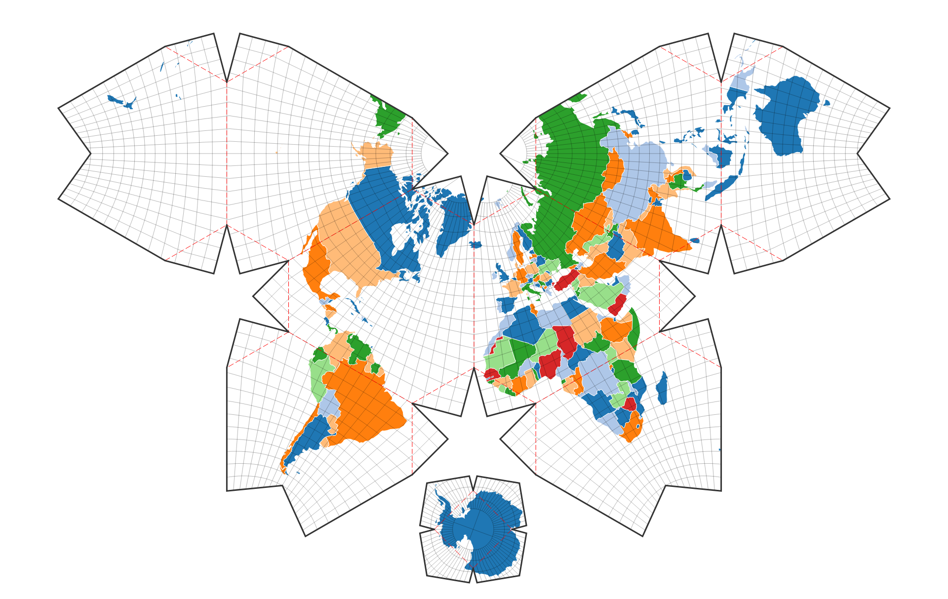
Waterman Butterfly

Not the best map for lepidopterophobes.
Invented: Steve Waterman, 1999, inspired by Bernard Cahill, 1909
How to make it: Project your globe onto a truncated octahedron, and unfold, cutting out Antarctica to keep as a souvenir.
Pros:
- Preserves shape and size,
- Maintains reasonable latitude and longitude lines, and gives a good indication of north and south,
- In one version, shows the continents as a well-connected whole like in the Dymaxion map,
- Finally, a world map that represents Antarctica correctly!
- Doesn't fit incredibly well onto a page,
- A few of the latitude and longitude lines are not smooth.
The Atlantic-centred projection. It's quite easy to see here how it's been unfolded.
I'm a big fan of this map, particularly the Pacific-centred form. It makes for great posters, since there is space for information around it when on a page. As well as this,
it's very clear to see how it translates to the surface of a sphere (and indeed, demonstrates well to the viewer how the world is not a flat rectangle).
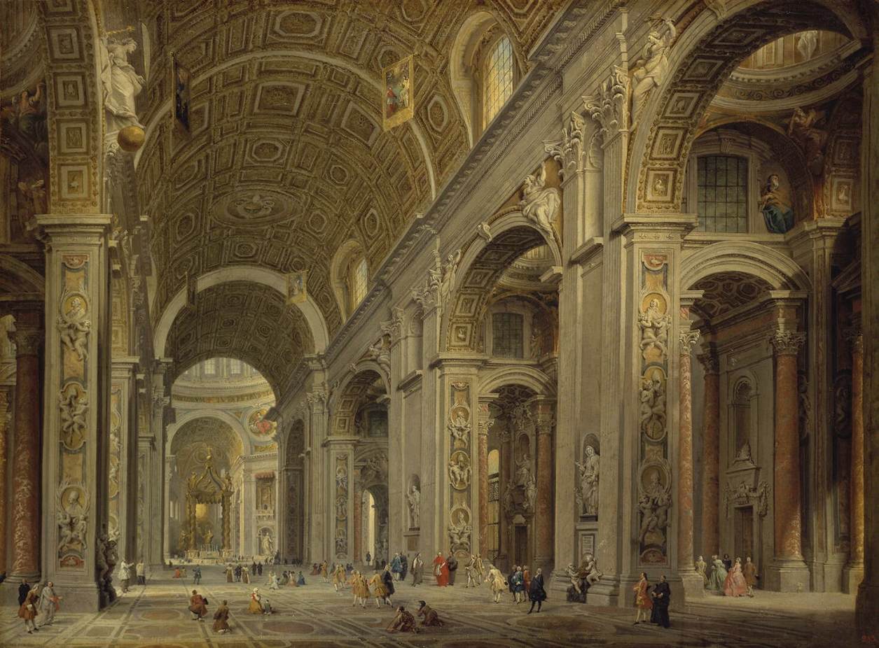
Bonus: Panini Projection
St. Peter's Basilica, Giovanni Paolo Panini.
The task of projecting a sphere onto a plane is not exclusive to mapmakers - because visual information comes in from all directions, sphere projection is vital for painters, photographers and, more recently, high-spec gamers, who want to most closely approximate the experience of viewing a place.
The standard projection used in first-person gaming is the rectilinear projection, where each object's angle is projected directly onto a plane sitting just in front of the viewer. This means that, if done right, viewing an environment through your screen is exactly like looking through a window. However, this only allows for small viewing angles - for video games, 90 degrees is considered a fairly large field of view.
For high angles, the rectilinear projection becomes very distorted. Here I use a program called Blinky by shaunlebron to show what the rectilinear projection looks like at wide fields of view:

We can see that while 110 degrees is alright, as we come closer to 180 degrees the projection becomes effectively useless. For the record, the human field of view is roughly 200 degrees, which is impossible to project with a rectilinear method.
It was for this reason that the Pannini (or Panini, for sandwich lovers) projection was designed. Inspired by the perspective techniques of painter Giovanni Pannini/Panini, the projection is supposed to achieve a more sensible view of wide-angle scenes, even beyond 180 degrees wide. The image is achieved by first projecting the surroundings directly towards the viewer onto a cylinder, and then projecting an image of the cylinder outwards onto a plane, from a point behind the viewer (for a good description of the process, I'd recommend TKSharpless' page or shaunlebron's interactive demo on the topic). Here's a comparison of different fields of view displayed in this way:

The Panini projection is an answer to the same problem that Mercator tackled back in 1569, but instead of allowing us to map the world, it allows us to present more of the vistas we want to photograph and paint, and play video games with an experience closer to the real thing.
(By the way, I'd highly recommend downloading Blinky and having a play around. Playing Doom in a Pierce Quincuncial view is a very interesting experience.)
If you've stuck it out this far, congratulations. Hopefully you'll agree with me that the true mistake made by schoolteachers, and anyone else who picks a Mercator projection simply because it's the most popular option, is not in choosing the wrong map, but in assuming that there's only one best choice. This post hasn't even come close to covering all the different projections - or types of projections - and it certainly hasn't covered most of the good ones. But it might be enough to take your idea of how the world can look, and change it from a narrow field of view to a wider one.
"True geographers use the orange rind projection" - u/PorcineLogic, 2013
Comments
Post a Comment